Fever
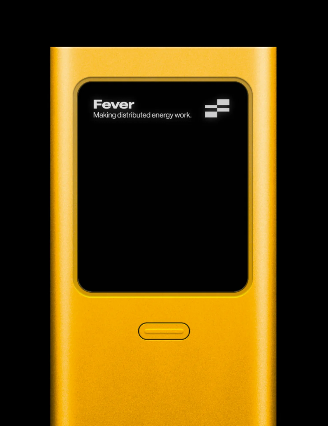
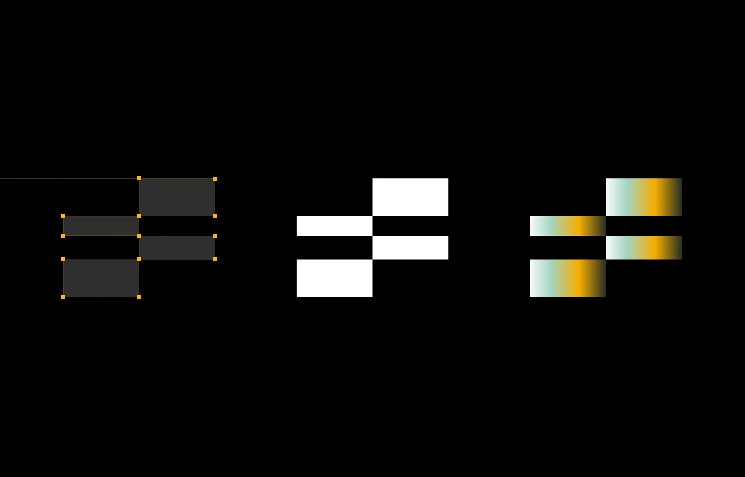
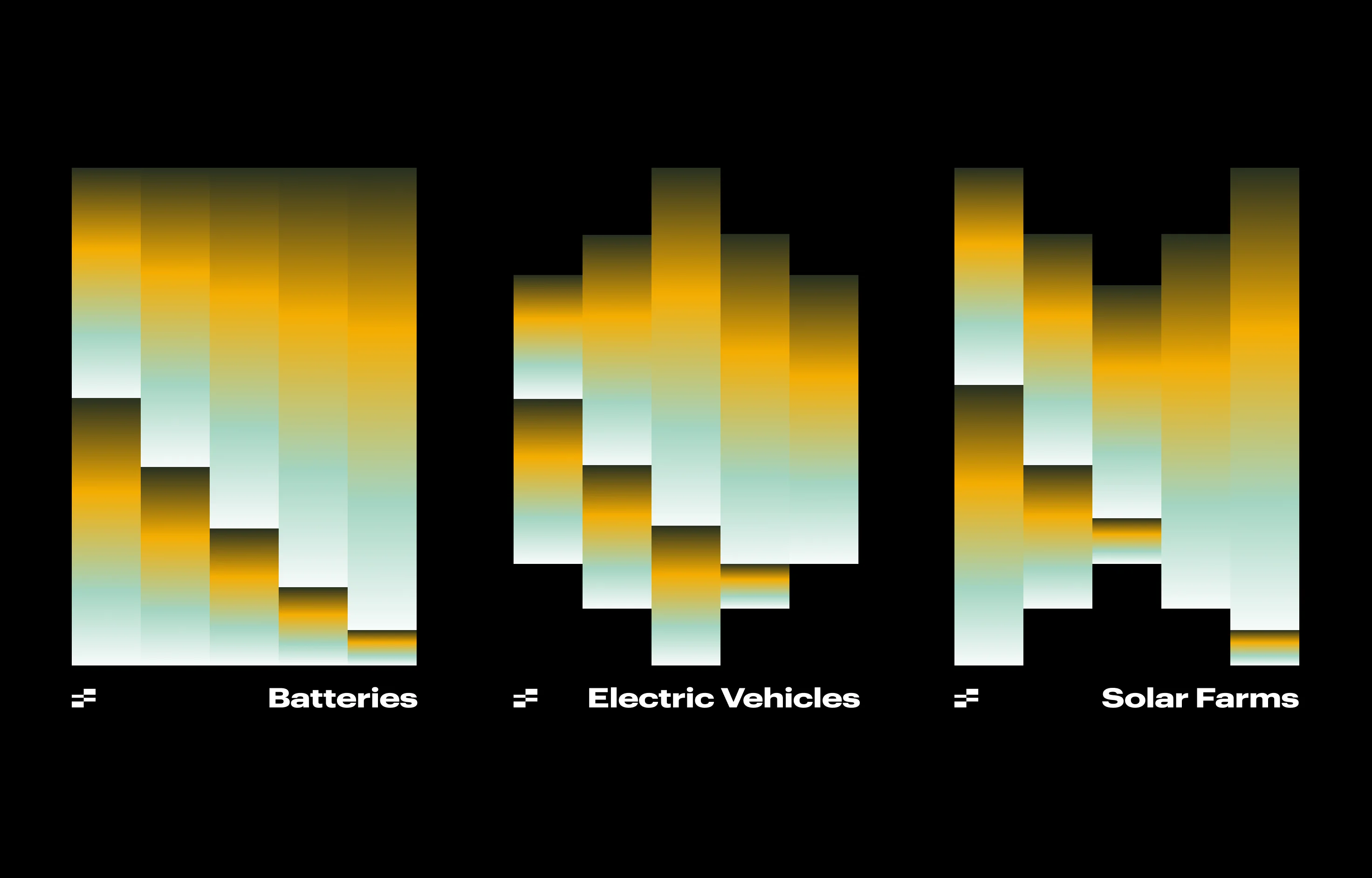
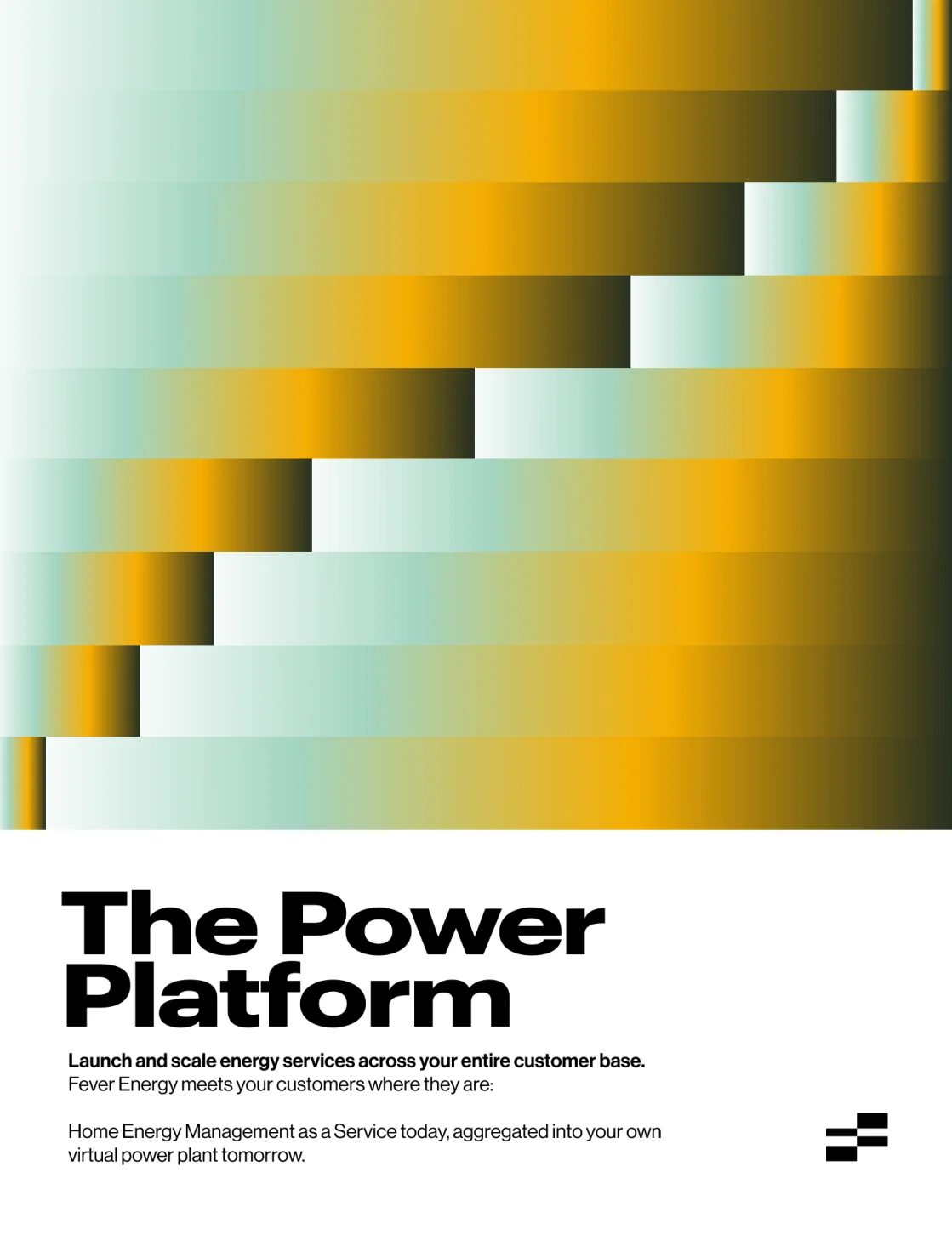
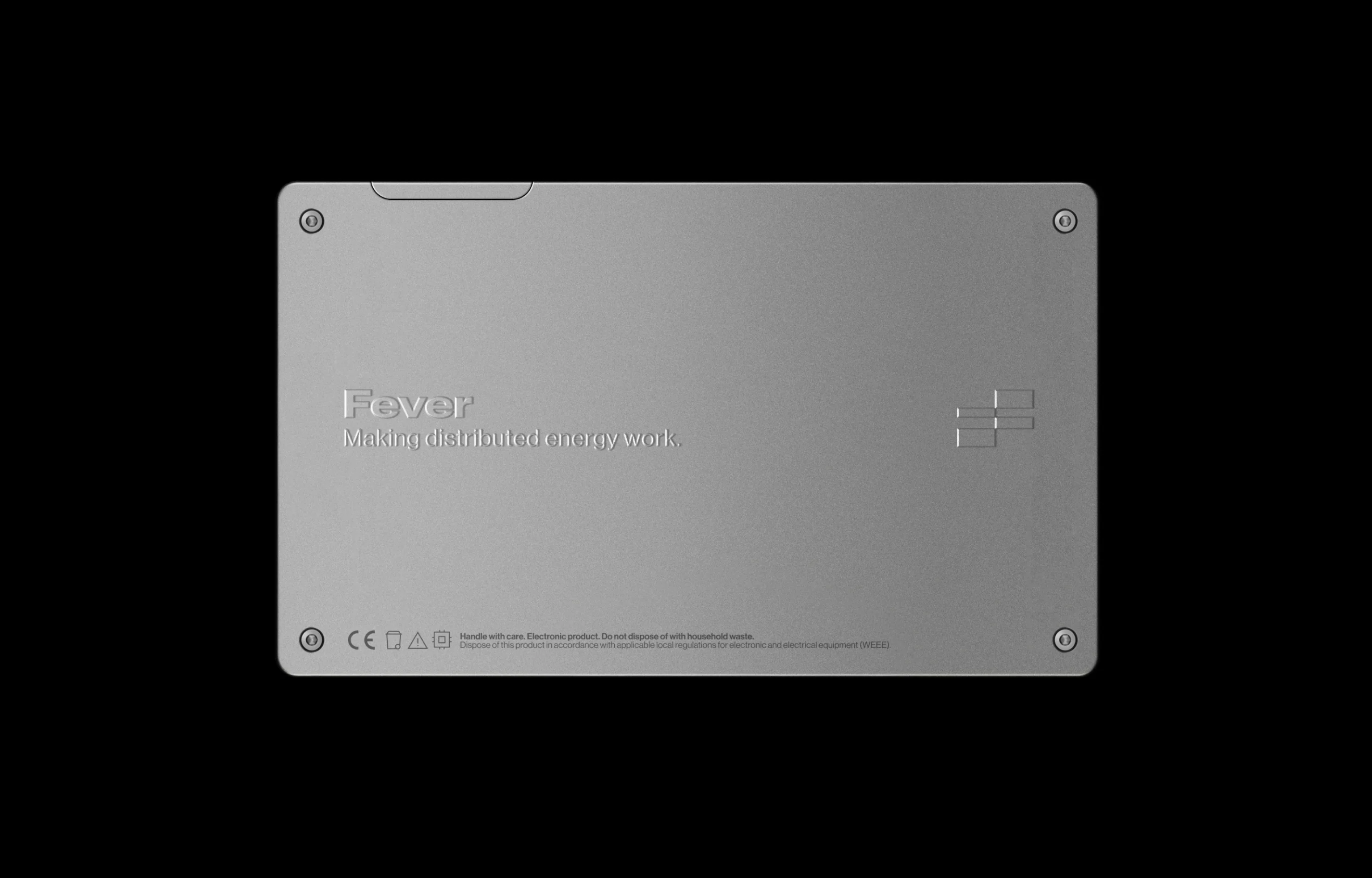
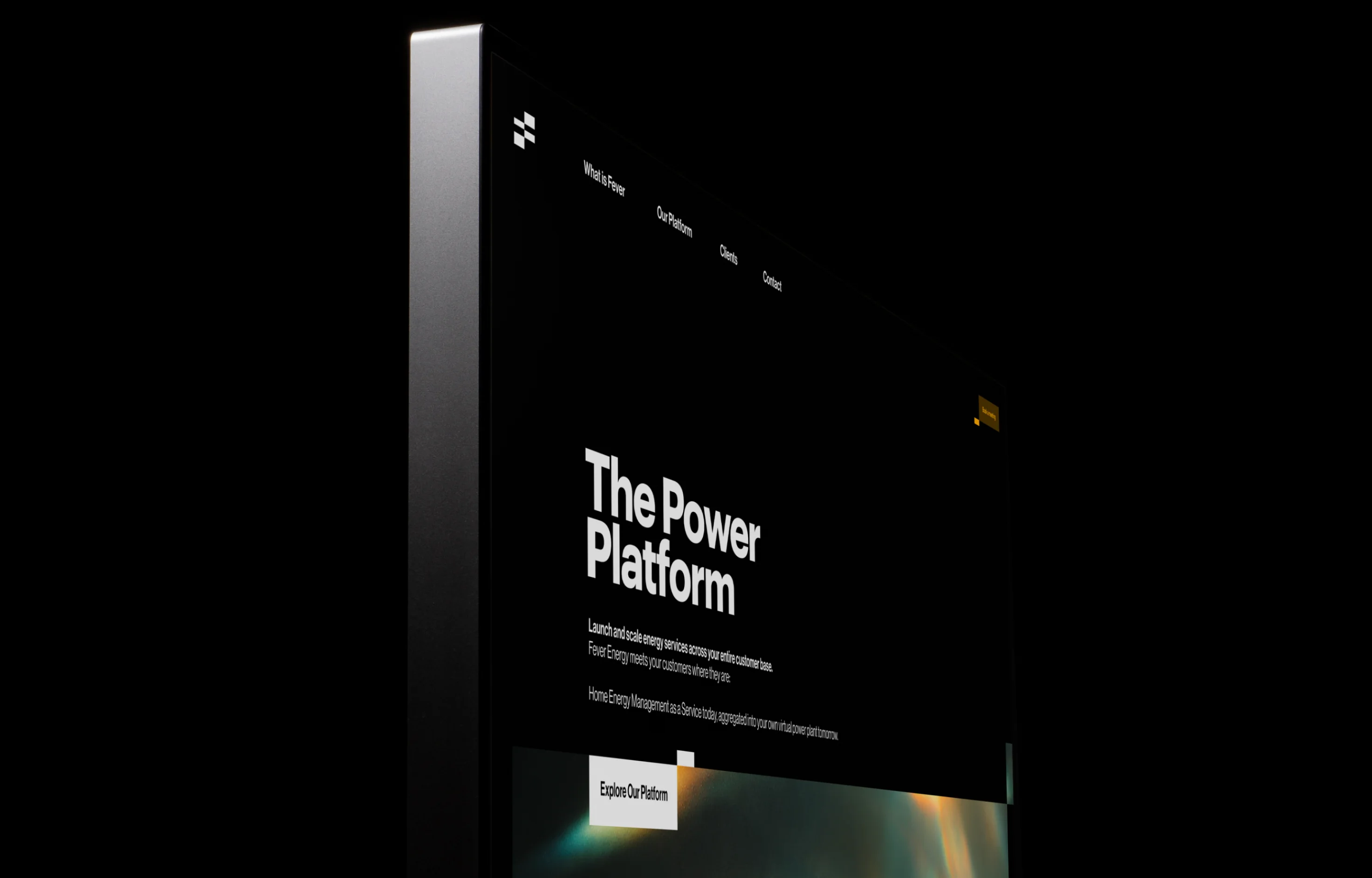
is rethinking how we use energy. At the heart of it is load balancing: moving power around a network and making better use of what is already there. That became the starting point for the identity too. We built the logotype and icon from a simple network of blocks, filling and emptying different parts to create the forms. A small system inspired by how Fever itself works.